
SIMPLE PHOTOGRAPHY TIPS FOR BAKERS
Updated: Jan 1, 2023
“The whole point of taking pictures is so that you don’t have to explain things with words.” — Elliott Erwitt

As the saying goes "A picture is worth 1,000 words".
Your photos for your desserts should say 1,000 words to reflect how beautiful they look how delicious they taste. Photos should be clear, inviting, and make customers want to purchase your desserts. Your photographs represent your brand and set the tone for the image you want to project for your business. They should always be top notch for all media channels such as your website, social media pages, and marketing materials (flyers, business cards, banners, etc).
Below are a few tips to use when taking your photos of your desserts: 1. Use natural light. Take photos between 9:00 a.m. and noon, and between 3:00 and 5:00 p.m.
2. Keep your photos simple. Less is more. You want your audience to focus on your dessert, and not busy backgrounds or fancy filters.
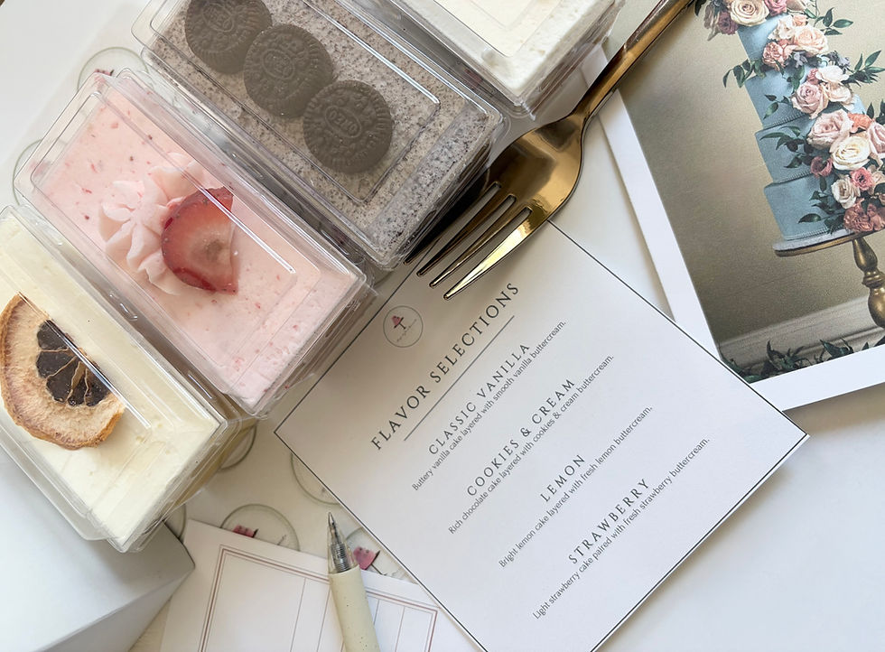
3. Make sure your desserts are picture perfect. Take the time and effort to ensure that your desserts are camera ready. This means making sure cupcakes are evenly frosted, and cake edges are sharp. DO NOT take photos of your desserts in boxes and cupcake containers. You can take all of the pictures in the world, but if your desserts are not photo ready, it's a lost cause.
4. Have theme and colors selected for your photos. Neutral colors such as white, gray, and cream provide simple but elegant backdrops. Use complementary colors to the dessert(s) you are photographing. If you are photographing cupcakes with pink frosting, consider using shades of pink, green, or blue as background colors.
5. Take shots in several different angles. Try taking your photos using different angles. It provides a different dimension to your photos, and you can have several different photos of the same dessert.
Make sure your photos are always on point. You never know who’s watching you!!

88vbet mình thấy được nhắc hoài nên cũng bấm vào xem thử cho biết, kiểu lướt nhanh chứ không ngồi đọc kỹ. Giao diện nhìn khá thoáng, chữ không bị dồn và mấy phần nội dung được chia khối rõ ràng nên kéo xuống không bị rối mắt. Mình có để ý đoạn giới thiệu thương hiệu họ ghi luôn mốc thành lập năm 2016 ở Philippines, đọc cái là hiểu họ muốn nói về nguồn gốc từ đâu. Ngoài ra có chỗ họ để số liệu hoạt động theo dạng khung bảng nên nhìn gọn, không phải mò trong một đống chữ dài. Nói chung cảm giác site làm “sạch” và dễ theo dõi, nhất là mấy box thống…
kuwin tối qua mình mở trên laptop lúc nghỉ tay một chút, chỉ nhìn nhanh cách họ bày trang chứ không đọc kỹ nội dung, và thấy bố cục kiểu thẳng hàng nên mắt bắt được ngay khu nào là khu đó, khỏi phải lia qua lại nhiều. Menu nằm chỗ dễ thấy. Bấm qua vài mục khá lẹ. Mình để ý mấy khối thông tin họ chia dạng ô vuông ô chữ nhật nên kéo xuống vẫn gọn. Chữ nhìn thoáng. Không bị dính nhau. Xem trên điện thoại cũng ổn, ít phải nheo mắt. Nói chung ai cần lướt giao diện thì chắc sẽ thích kiểu trình bày này. Ở dưới có mấy bảng số liệu để theo…
cổng game go88 tối qua lúc nghỉ giữa giờ mình lướt đại để xem trang “giải đáp thắc mắc cho người chơi mới” viết kiểu gì, vì nhiều chỗ hay nhồi chữ nhìn phát là mệt, ở đây thì họ chia theo từng câu hỏi riêng nên mình quét nhanh vẫn hiểu đại ý, nhất là đoạn nói về đại lý và mức hoa hồng 5% đến 20% ghi thẳng ra, không vòng vo. Mình không đọc kỹ hết. Chỉ thấy bố cục khá gọn. Chữ dễ nhìn. Các khối nội dung tách ra rõ nên kéo xuống không bị lẫn. Mấy tiêu đề hỏi–đáp đặt đúng kiểu “đọc đến đâu biết đến đó”, nhìn là biết đang ở phần…
x88 trang chủ chính thức mình thấy bạn bè nhắc vài lần nên cũng ghé thử cho biết. Vừa vào là cảm giác trang khá gọn gàng, nền nhìn sáng sủa, chữ dễ đọc nên lướt nhanh không bị rối mắt. Mình không tìm hiểu sâu mấy phần giải trí đâu, chủ yếu xem họ sắp xếp nội dung thế nào thôi. Có mấy mục kiểu tra cứu “xổ số hôm nay” nhìn đặt ngay ngắn, tiêu đề rõ nên ai cần xem kết quả chắc bấm cái là ra. Mình cũng để ý các khối nội dung chia theo từng đoạn, kéo xuống vẫn thấy mạch thông tin liền lạc chứ không bị nhồi quá nhiều thứ một lúc.…
Bomwin mình thấy ai đó nhắc nên tiện tay vào nghía thử cho biết, kiểu xem giao diện với cách họ trình bày thôi chứ không ngồi đọc sâu. Vừa vào đã thấy mấy tiêu đề to rõ ràng, đặc biệt cái “Cam kết đổi mới và bền vững” nhìn phát là hiểu họ muốn nhấn mạnh gì. Phần giới thiệu về Études cũng viết gọn gàng, nói chuyện kết hợp sáng tạo với tính thực dụng nên lướt qua không bị rối mắt. Mình thích kiểu họ chia nội dung theo từng khối, cuộn xuống là thấy các đoạn tách bạch, không bị dồn chữ một cục. Nói chung cảm giác site làm khá “thoáng”, dễ nắm ý chính.…